Bind A Power BI Thin Report To A Local Model
/It isn’t terribly difficult to rebind a thin report to another model in the Power BI service. I’ll let you ask your favorite LLM how to do that. When I asked Grok I was given 3-4 options, but they all assume your model is in the service.
You may have an issue though where it isn’t in the service and you need to connect your report to a local model on your desktop. This can be useful if you need to do some testing and don’t want to connect it to a model in the service, or you temporarily don’t have access to the service. Let’s see how this works.
What you need:
Your thin PBIX report file. You can download this from the service if necessary.
Your local model in Power BI Desktop. It must be up and running.
Windows File Explorer
Let’s get started, but before we do, make a backup copy of your thin report file in case something goes sideways. Below you can see I am in Power BI Desktop and I have Adventure Works open, and it is a thin report connected to the model in the service.
First, save your thin report to your hard drive as a PBIX file and close it. Rename it to a Zip file, so “My Thin Report.PBIX” becomes “My Thin Report.ZIP”
Below you can see that my file extension isn’t showing. That is because by default that is turned off in Windows 11. You can either turn it on, or rename the file using the command line. I prefer to leave that setting off so I’ll open a command line and rename it there.

After renaming it, you can see the icon has changed, and Windows shows this is a compressed file type. It actually says it is a compressed folder. That is incorrect, but Windows File Explorer will let you treat it as such.

Note that we do not want to manually unzip and zip the file. We are going to let the File Explorer handle everything for us. We need do a few steps:
First, double-click on the file. You will now be in the contents of the file and see the following:

We are only concerned with two files here - Connections and SecurityBindings.
Right-click on SecurityBindings and delete it. It is a binary file that has security information about the connection necessary to connect to models in the service, but not only is it not necessary for desktop connections, it will prevent them, so just delete it.
Next, copy the Connection file and paste it in a real folder in Windows Explorer. We do not want to edit it while it is part of the ZIP file. Don’t cut it either. Just copy it out. My folder now looks like this:

Right-click on the Connections file and open it in Notepad or your favorite text file editor. Your file will look something like this:

We need to make a few changes. The easiest thing to do might be to just replace it with the code below. We don’t need any of the connection strings or GUIDs to the workspace or models.
You need to modify one thing though - the 99999 for the local host is wrong. You need to get that from your Power BI model.
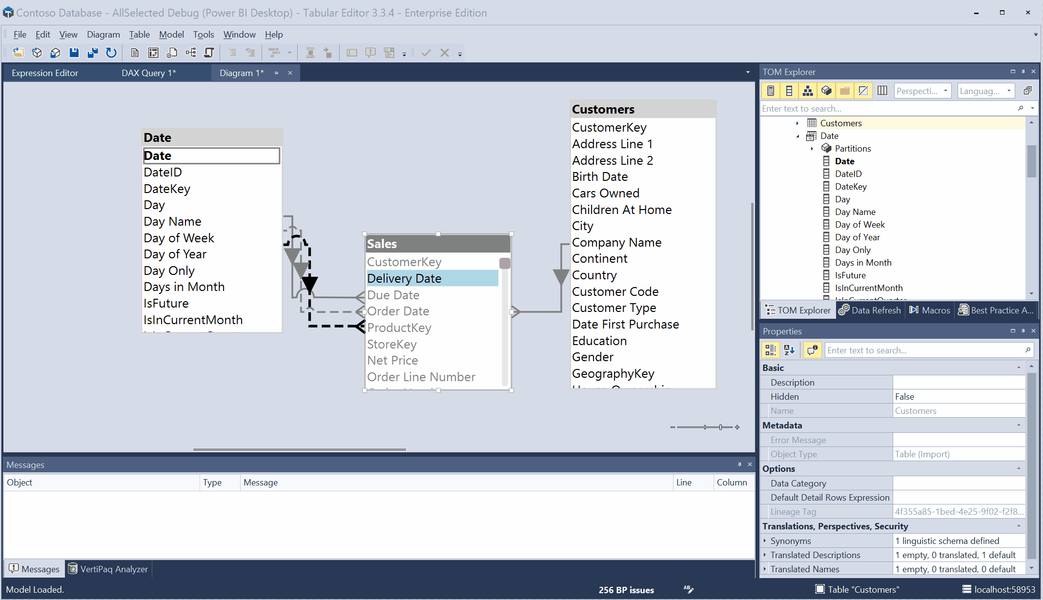
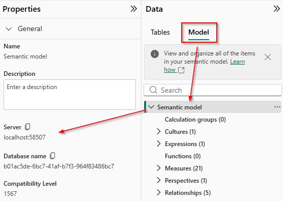
Go to the Modeling tab on the left side of the Power BI user interface
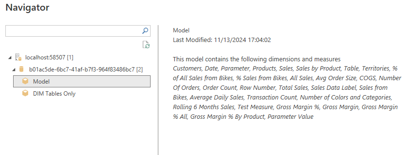
In the Data pane click on the Model tab
Click on “Semantic Model” at the top
In the Properties pane to the left, you want to copy the Server info. In my case, it is localhost:58507
So my final connection file looks like this:
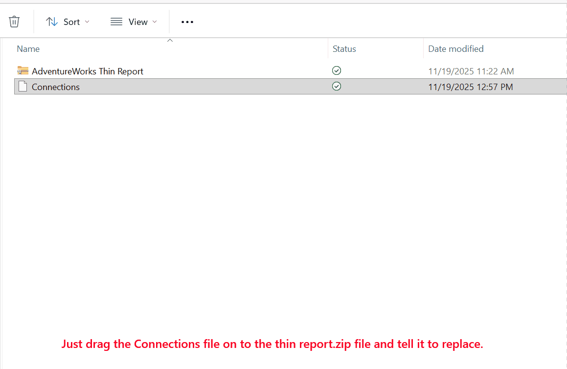
Save the file in Notepad, then close it. Now just drag the Connections file to the thin report ZIP file and tell Windows to replace it.
Now rename the file extension back to PBIX, and double click it to open it in Power BI Desktop.
A navigation screen will open. Expand the Database ID and select the Model and press ok.
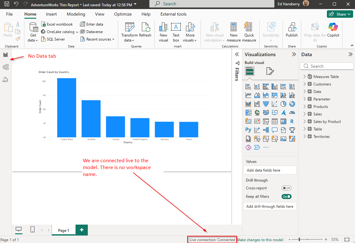
If you have done everything correctly, it will open up and be connected to your local model. You can see in the image below that this is a thin report (no Data tab), it is a Live Connection, and just says Connected - no workspace name, and all of the model contents are available in the Data pane.
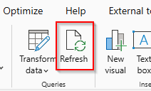
You are now free to develop using the local model. Keep in mind if you make any changes to the local model, you will need to click “Refresh” in the thin report to see those changes.
If you close your desktop model and reopen it for some reason, it will get a new 5 digit port number. You won’t need to manually edit the ZIP file or Connections file though. Power BI will walk you through it. First it will throw this error up:
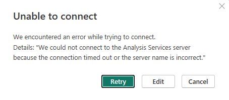
Click on the Edit button and you will get the SSAS Database connection screen:

Now, go back to your running copy of Power BI that has the actual semantic model in it, and on the modeling tab, you will need two values:

Copy both the Server and Database name to the SSAS connection dialog box and press OK. It will think for a few seconds and bring up your thin report, fully connected to your local model.
If you ever want to reconnect this thin report to a model in the service, just use the Get Data|Power BI Semantic Models menu option and point to the desired model.
I want to thank Steve Yamashiro, whom I work with and learn a ton from all of the time, for this method.