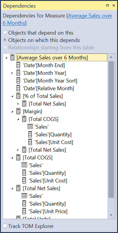
Always Use Explicit Measures - Wait, What Is An Explicit Measure?

All of your analytics in Power BI are done with measures, and there are two ways to create measures. It is important to understand the difference between the two methods. If you drag a field from the data pane directly into a visual, that is an implicit measure. The model usually wraps it with SUM(), but other aggregations are possible, like COUNT() or AVERAGE().

Creating an implicit measure

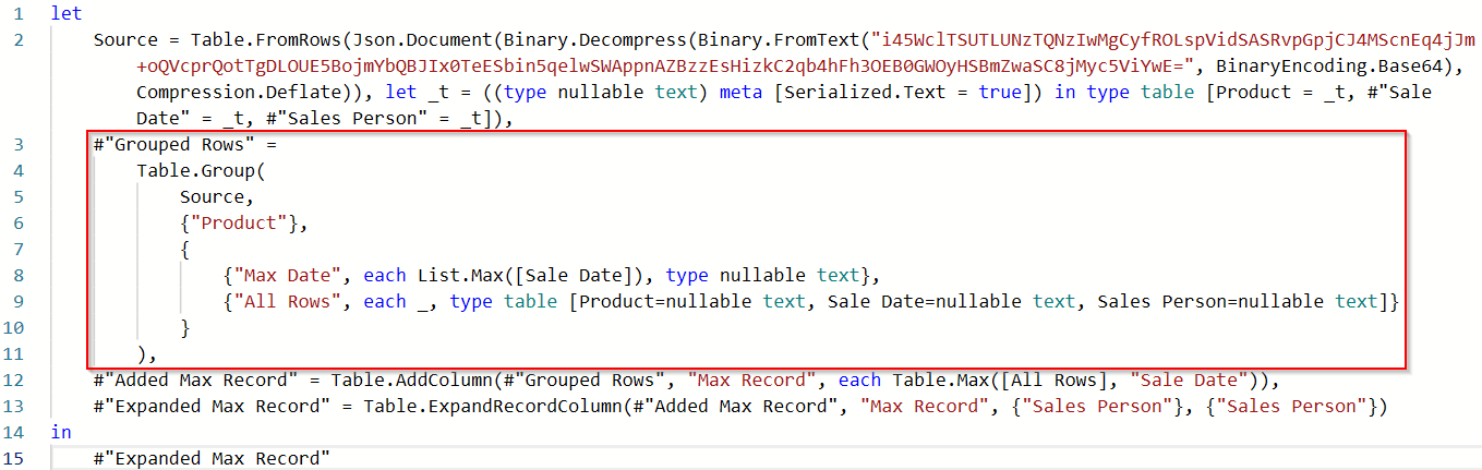
In the above image, I am dragging the Profit field to the table, and Power BI is using the SUM() aggregation. The query Power BI uses to actually generate this table visual is below:

Implict measure in the DAX query

You can see it wrote SUM(‘financials’[Profit]) and wrapped it with CALCULATE(). That CALCULATE() is important later. Side note: If you’ve ever heard someone say they don’t use CALCULATE() in their reports, that is just nonsense. Whether you use the CALCULATE() function in a measure or not, Power BI uses it all of the time.

An explicit measure is when you explicitly write a measure using the DAX functions you need. For example, Total Profit = SUM(‘financials’[Profit]) is an explicit measure. Once created, I would then drag [Total Profit] to my visuals. The DAX query when using an explicit measure might look like this:

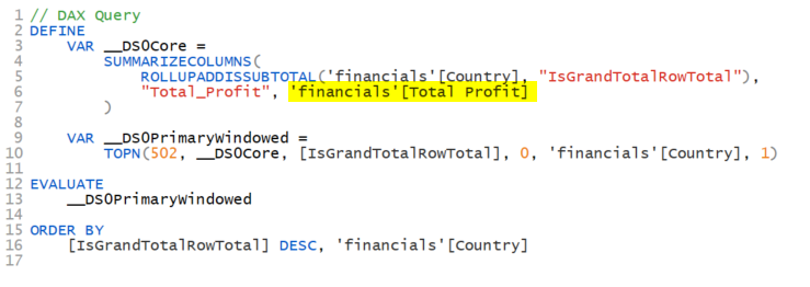
Explicit measure in a DAX Query

Here it is using the [Total Profit] measure. Notice there is no CALCULATE() function in the query. That is because when you refer to a measure, there is an implicit CALCULATE() already. It is as if the above said CALCULATE(‘Financials’[Total Profit]). Got it?


  • When you use an explicit measure, the DAX query for your visual will have an implicit CALCULATE().

  • When you use an implicit measure, the DAX query for your visual will have an explicit CALCULATE().


Don’t worry. That is as complex as this article gets.😉 It just helps to understand what goes on under the hood.

Note that Power BI always puts the table names in front of measures within the queries it generates. This is a bad practice for you and me. Never do this when writing measures, calculated columns, or calculated tables. The rule is:

  • When referencing a measure, always exclude the table name.

  • When referencing a column, always include the table name.

What Power BI does when building its own queries is its business. You’ll need to understand how to read the code, and you can see in the query above it appears it is referencing a Total Profit column, but it isn’t. Ok, enough of that tangent.

So, what difference does it make whether or not you use implicit or explicit measures? Here are the differences:

Advantages of implicit measures:

  1. Easier when adding a field to a visual.

Disadvantages of implicit measures: (not comprehensive)

  1. You cannot edit the measure in order to change the calculation. Say you had dragged in the ‘financials’[sales] field into a measure and it created the implicit SUM(‘financials’[sales]) measure, you cannot change it, other than the aggregatio type (COUNT, AVERAGE, etc.) If you need sales to be the net sales calculation by subtracting cash discounts, you cannot. You now have to write an explicit measure that might look like Net Sales = SUM(‘financials’[sales]) - SUM(‘financials’[cash discounts). Now you will need to remove your implicit sales measure from any visual that was using it and replace it with the new business logic. That is a lot more work than just editing an explicit measure had you created one in the first place. Be kind to your future self.

    1. This particular problem magnifies itself if you have added conditional formatting to that field. Once you swap out the implicit measure with an explicit measure, you have to redo all of the conditional formats!

  2. You cannot build off of it. The beauty of measures is you can create new measures that use other measures, and if you change the original measure, the dependent measures will automatically take in that new logic.

  3. Implicit measures do not work with Calculation Groups.

The Calculation Group thing is HUGE. What is the problem here?

I’m not going to do a deep dive into Calculation Groups. Others have already done a fantastic job here, so go read their blogs.

Consider the following visual. It has two measures.

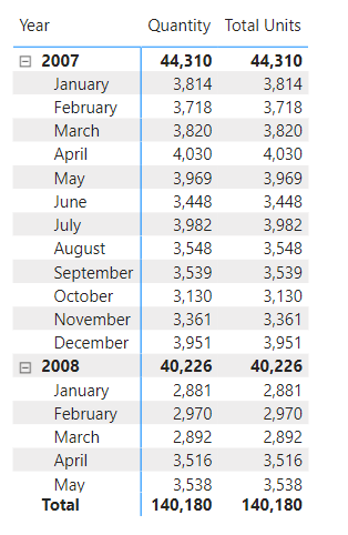
The Quantity column is an implicit measure. I just dragged the Sales[Units] field into the visual and called it Quantity. The Total Units column is the explicit measure Total Units = SUM(Sales[Units]).

Now, I want to have another set of columns that will show me the units in the same period last year. I could create a new measure for this, or I could use a Calculation Group. The latter is more versatile, so I’ll do that. Using Tabular Editor I created a Time Intelligence Calculation Group with Current Period and Prior Year Calculation Items. Here is the full DAX for how that will work. Again, this isn’t an article to teach you how to create Calculation Groups. I’m focused on the downsides of implicit measures.

Logic in the Calculation Group

When I drop that Calculation Group to the Column section of the matrix, I get this visual:

Do you see the problem? The Current Period columns are fine. But look at the Prior Year columns. The Quantity column is showing the same as the Current Period. That is wrong. But the Total Units measure correctly shows the units from the prior year. Why is that?

It is the SELECTEDMEASURE() function in the Calculation Items shown above. That is how Calculation Groups work their magic. They have but one flaw. They cannot see implicit measures, so they ignore them. Power BI protects you from this though. When you create a Calculation Group, the model flips a switch that blocks the creation of additional implicit measures. Notice the DiscourageImplicitMeasure property. By default this is set to FALSE, but when you add a Calculation Group to a model, it gets set to TRUE.

Discourage Implict measures enabled

Now if you drag a field to a visual expecting a quick calculation, you won’t get one. It will either just show the values in that field, or block you from adding it to a visual outright. The property is called “Discourage Implicit Measures” and not “Block Implicit Measures.” The reason is the tabular model cannot foresee all possible third party clients working with the model, but for Power BI Desktop or writing a report in the service, it is a block.

So we’ve seen implicit measures are fast and easy to create, but have a number of shortcomings. I know it takes an extra 30-45 seconds to create an explicit measure, but trust me, creating explicit measures is a best practice. It will save you additional work in the future, and if you introduce Calculation Groups to your model, will help ensure they are returning the expected results.

Tips for Debugging your DAX Code

When trying to get your DAX measures to work correctly, there are a number of tools you can use to debug, which I will briefly mention, but not go into depth on. Instead, this post is about how to think about debugging your code. I am focusing on DAX here, but many of the methods would apply to any type of code.

First, the tools you can use. This is not a comprehensive list, just something to get you started.

  1. Use Variables. Variables have several benefits:

    1. Variables are processed one time and can be reused later in the measure in multiple places. This can speed up your code.

    2. You can return a variable result to the visual itself. This allows you to see what each component is doing to ensure each part is calculating correctly.

  2. CONCATENATEX - If a variable returns a table, you cannot return that variable directly to the visual. A measure requires a scalar (single) value. CONCATENATEX will convert a table to a scalar value so you can see everything in that table. You can also use the newer TOCSV or TOJSON functions, which do similar work different ways. TOCSV and TOJSON are the underlying functions that help EVALUATEANDLOG return results, and aren’t really meant to be used in a production model, but they are handy in debugging.

  3. EVALUATEANDLOG - This is a relatively new function that will generate a ton of output for each expression you wrap with this function. There is a massive 4 part series on EVALUATEANDLOG here, including links to download the free DAXDebugOutput tool that will be necessary to read what this function returns. Note: Be sure to remove EVALUATEANDLOG once you are done. It will slow your code down. You should never publish a report that has this function in it.

  4. Tabular Editor 3’s Debugger - This is simply the luxury vehicle for debugging DAX. More about this tool is here.

Instead of an in-depth look at these tools though, I want to look at the thought process when debugging and offer some tips.

First, when debugging DAX, be sure to do it in a Table or Matrix visual. You need to be able to see what numbers are being returned for each value in the columns and rows. This is impossible to do efficiently in a bar or line chart. To quickly convert your visual to a table or matrix, make a copy of it in Power BI, then while it is selected, select the Table or Matrix visual icon in the Visualization Pane. You might need to move fields around to get the correct fields in the Rows, Columns, and Values section.

Next, make a note of any filters you have set in the Filter Pane, then clear or remove them. You need to understand what the core calculation your measure is doing before any filters are applied. This may not be the result you want, but you have to start with the unfiltered result. For example, you might only be interested in getting an average 12 months of sales for Texas, but if the [Average 12 Months of Sales] measure is wrong at the global level, having your report filtered for United States is only muddying the issue. Make sure that figure is correct globally first. Then you can apply filters. If you apply the United States filter and Texas is still wrong, it is possible your measure is fine, but you have a problem in the data. Zip codes are assigned to the wrong state for example. But you will never figure that out if you have no confidence the measure itself is correct. When debugging DAX measures and queries, we take for granted that our data is good. That isn’t always the case, so keep that in mind.

We’ve all built reports where we create 3-4 measures, then create several measures with new logic and include those original measures. and before you know it, you have 40 measures with a complex web of dependencies. And the measure you are debugging references 8 of those measures.

dependency view from Tabular Editor

As you can see above, a single measure can have many, perhaps dozens, of fields and measures it is dependent upon. When this happens, I generally tear down the measure to the component parts, even replicating code from other measures into the one I am debugging. Often I find some code in one of those dependencies that works great for that particular measure in a specific chart, but it doesn’t work well when used inside of your measure. Context Transition can be invoked at the wrong granularity (subtotal or total level) and return undesirable results, or it has a particular filter applied or removed using CALCULATE. Start simple, and rebuild it. Once you get it working, you can replace the duplicated code with the measure it came from. Sometimes though you might find your new code runs much faster. Iterators like SUMX and AVERAGEX often benefit from streamlined code vs using measures. As already noted, using measures in iterators can produce undesirable results at the total level. Look at these two examples:

Average Sales per KG = AVERAGEX(Sales, Sales[Units] * Sales[Price] / RELATED(Products[KG]))

Average Sales per KG = AVERAGEX(Sales, [Total Sales] / [Total KG])

If you put both of those measures in a table and it is by invoice number, they will both produce the correct results at the detail level. However, the second example that uses measures will not produce correct results at any sub-total or grand total level. It will total the sales for the entire table then divide that by the total of the kilograms. A useless result. (Ignore I am using the / symbol vs DIVIDE(). I am going for clarity here, not best practice.)

So here, reusing measures actually cause a problem. That is not often the case. I am a huge fan of reusing measures, but it isn’t always the answer, and can make debugging more challenging. Never assume your dependent measures are correct, or at least correct for your current needs.

Next, take a step back and try to understand the question being asked. Have the question phrased in plain business language. For example, here are two ways you can be presented with a question from a user for the report:

  1. I need to get the total sales where the Relative Date is 0 through -7.

  2. I need to get the total sales from today going back 6 days.

Those are not even the same question, and there are several ways to interpret #2.

  1. You’ll notice in #1 that is a range of 8 days. So if you are getting that type of request from a user or co-worker, you might not think to push back, Instead you may give them a simple measure with a filter predicate like ‘Date’[Relative Date] <=0 && ‘Date’[Relative Date] >= -8. That filter is correct, but it likely answering the question in the wrong way.

  2. When the person says “today going back 6 days” what does “today” mean? Today’s calendar date, or the latest date in the model, which might be a few days ago. Using TODAY() in a measure and then walking back 6 days will give the most recent 7 days, but the last 2-3 days might have no values if there are weekends or holidays involved. That might be correct. It might not be.

The point is, understand in plain English what your user is needing in the visual. Then you can start to craft the code to return that value. But if they start talking all DAXy to you, you might be debugging the wrong logic.

Do it in Excel first. Or have the user do it in Excel. Sometimes pointing directly to cells will allow you to understand the logic. You can rarely convert Excel formulas to DAX, but once you understand the logic of what is happening, writing the DAX becomes much easier. And you will also have the benefit of the correct answer in Excel you are trying to match.

You can also write it out on paper, or better yet, if you are on site, use the biggest whiteboard you can find and draw the logic out there.

Sometimes you just need to a break. Go for a walk. I have solved tons of problems a few miles from home on my morning walks. Staring at the same code can reenforce that bad code in your head and you cannot see a way around it. Stepping away removes that barrier.

Ask for help. I cannot stress this enough. Innumerable times I’ve asked for help and in just talking through the problem, I find a new path myself without the other person haven spoken a word. Some people call this “talking to the rubber duck.” Put a rubber duck on your desk and when you get stuck, tell the duck what the issue is. Just talking out loud you have to go much slower than thinking through it, and that alone helps.

Of course, asking someone can reveal the answer or a path forward. Ask a co-worker. Many organizations have Power BI or data analytics groups in Teams, Yammer, Slack, or other collaboration tool. Don’t be afraid to jump in with the question or ask for a meeting where you can do a screen share. I have helped others that had super basic questions a new person to Power BI would ask, and I’ve been on 2-3 hour screen shares where I and a co-worker untangled a gnarly problem. Sometimes it was my problem, sometimes theirs.

There are also the public forums, like the Power BI Community. It is especially important in those communities to give adequate sample data in a usable format - CSV or XLSX, and a mock up of the desired results. Don’t take shortcuts with your question. The people you are talking to know nothing about your scenario, so where you can take shortcuts with your co-workers that know the data and the company, forum members don’t. So carefully explain the issue.

One of the latest fads is to ask ChatGPT. That is ok as long as you don’t trust the code for the correct answer. I’ve found ChatGPT doesn’t always return code that even works, let alone code that returns an accurate result. However, it can help directionally, and suggest functions, or different ways to shape and filter the data you might not have thought of.

Regardless of where you might get an answer, verify it is correct. It may return a number, but verify it is the correct number.

Hopefully the above tips will help you rethink how you approach a problem you are stuck on. Of course, learn the debugging tools and techniques mentioned above. The best time to learn those tools is when you don’t need them. Have a complex measure that already works? Awesome. Throw a table visual with that measure into Tabular Editor 3 and see how the debugger works, or wrap some of the variables in EVALUATEANDLOG and see what the DAXDebugOutput tool generates. Then when you do have a problem the output from these tools will be familiar to you.

Working With Multiple Windows in Tabular Editor 3

If you have started using Tabular Editor 3, and I highly recommend you do if you do any serious development work with Power BI/Tabular models, you should spend some time working with the tabs and making the most of the screen real estate.

This doesn’t really deserve a full blog post, but the animated GIF I created to demonstrate what I am talking about is too big for Twitter, so here is a small post explaining it.

Below there are 3 tabs: Expression Editor, a DAX Query, and a Diagram. I was working on a laptop where screen real estate was precious so wanted to toggle between the diagram and the DAX query using the Windows ALT-TAB shortcut.

Simply drag the Diagram tab out until it is free floating. Now it is part of the Windows ALT-TAB process. When done, drag it back into Tabular Editor until it is in the middle of that tiny control the red arrow is pointing to.

Of course, if you have multiple monitors or one of those crazy 49” monitors, you could drag tabs out to different areas to look at at the same time.

Working With Sparklines In Power BI - All About The Filter Context

With the December 2021 version of Power BI Desktop, as well as authoring reports in the Power BI Service, we can now add Sparklines to our Table and Matrix visuals. With just a few clicks you can make visuals that look like this:

This isn’t a tutorial on how to create sparklines as Microsoft has you covered there. What I want to discuss though is how Sparklines are impacted by the filter context in a visual. First though you need to enable this feature. It is in preview mode at launch, so go to File, Options, Options and Settings, and look for the Preview section. Click Sparklines, then close and restart Power BI Desktop.

In the visual above, I added the “Month” field to the Sparkline settings and that created an additional filter on the visual. Before I added the Sparkline, Year was the only filter affecting the numbers. By adding the month to the sparkline, shown below, it breaks out the Total Net Sales figure by month.

But what if I don’t want the sparkline to be the full range of data. For example, I just want the sparkline to show the last 3 months of the year, so 3 data points, not 12. As a measure, this is simple.

Sales Last 3 Months =
CALCULATE(
    [Total Net Sales],
    'Date'[Month] IN { 101112 }
)

As you can see, this returns the correct value as a value in the matrix, but the sparkline created for it using months is flat. Each of the data points are the same, and there are 12 of them, not 3. What is going on?.

This is context transition. When you alter a measure within Calculate, it does several things. This article isn’t a deep dive into context transition, but the key issue here is when I told it in the measure above to only show me when the ‘Date’[Month] column is within the values between 10 and 12, it replaced the existing filters coming from the Date table, which for months would be the values 1-12. You can see that here if I add the Month field to the table.

When only the Year is showing in the visual, you don’t see this. But the adding the Months field makes it clear what the model is doing. When I added the Month field to the sparkline setting, the exact same thing happened. Now, if you are pretty good at DAX, you’ve already figured out how to fix this. What we need to do is restore the filters on the Sales Last 3 Months measure so the total remains $2.7M, but the individual monthly amounts for October - December are retained. There are several ways to do this. First I’ll do it by restoring the values for month within the measure, and the VALUES() function is perfect for this.

Sales Last 3 Months =
CALCULATE(
    [Total Net Sales],
    'Date'[Month] IN { 101112 },
    VALUES( 'Date'[Month] )
)

Now for each row in the matrix, it looks at the month. For January, there is a 1. VALUES(‘Date’[Month]) returns 1, but the predicate ‘Date’[Month] IN {10, 11, 12}) is returning only 10 - 12. Remember that filters in DAX are tables, so it is a mini-table of 10, 11, and 12. And multiple filters in CALCULATE are combined using AND logic. So the table of 10, 11, 12, AND the table of 1, from the VALUES(‘Date’[Month]) function, returns nothing, because they don’t intersect at all.

This process repeats, and gives us blanks for months 1-9. But in October, VALUES(‘Date’[Month]) returns 10. That with AND logic for 10, 11, and 12 returns 10. So now it will show October sales. The same for months 11 and 12. We get this:

Now we have the correct value for months 10-12, and nothing for months 1-9. The total is still $2.7M, so it is working. Let’s remove the Months field from the visual and take a look at the sparklines now.

Bingo. That is exactly what we were looking for. Using VALUES is the easiest way for me to visualize what is going on in the model, but there is a better way, There is another function in DAX called KEEPFILTERS that is most often used within CALCULATE. Change the measure to this:

Sales Last 3 Months =
CALCULATE(
    [Total Net Sales],
    KEEPFILTERS( 'Date'[Month] IN { 101112 } )
)

KEEPFILTERS() will keep CALCULATE() from overwriting the filter for the ‘Date’[Month] column, and, well, keep the filters from that column, which is being supplied by the sparkline settings.

Sparklines has been a long requested feature, and I’m glad to see it has finally arrived. If you see unexpected results though, you have to step back and think about the filter that the sparkline added, and see if you have a CALCULATE in that field impacting how the filters work. KEEPFILTERS() is likely the way to fix it.

Add an Animated GIF to Your Power BI Reports

It is easy to add an animated GIF to your Power BI Reports. However, if you just add it as an image, it won’t animate. You’ll just get a static image.

Animated GIFs can be useful in reports to explain new features to users, or on hidden developer pages showing how certain things were done.

To add a GIF so it animates, do the following:

  1. Add a blank button.

  2. Make it huge.

  3. Select the Fill section for the button and turn it on.

  4. Select Add Image, and select the image from your computer.

  5. Set the Transparency level to 0%.

  6. Change Image Fit to “Fit” - this will allow you to resize the button and scale the image. Leaving it at “Normal” will require the button to be the size of the image, or it will truncate or use extra space on the page.

  7. Resize the button as desired to scale the image appropriately.

Then publish.

I have an example report here that shows this in use that shows the below animation in a report.

I use ScreenToGif to create my animations. Note: I had already posted this on Twitter, and wanted to add it to my blog so it would be more easily searchable. Since then I’ve also found out you can add animated GIF images to page backgrounds which are ideal for tool tip pages.

Be Careful When Filtering for Blanks in DAX

It is often the case in Power BI you need to filter your data to include or exclude rows where there are blanks. Be careful though, because you might get unexpected results. Consider this table:

Blanks0.png

It has 11 records, 2 of which are blank, and 3 that have $0 sales. Why would I have both blanks and 0’s in the same table? It depends on the data. Maybe blanks represent orders that are currently not finished, or were improperly filed out, whereas $0 represents orders where a customer ordered and item, but we were out of stock, so sales are $0 and we want that recorded. Let’s assume the data is correct, but we want to report on it in different ways.

Here is how you might try count the number of records that are not complete - the blanks.

COUNTROWS( FILTER( 'Sales', 'Sales'[Sales] = BLANK() ) )`

However, this may return different results than expected.

Blanks1.png

Instead, it returns 5. Why? If you want a deep dive into how Power BI handles blanks, see this excellent SQLBI article. The quick answer though is, when DAX evaluates BLANK() like this, it considers it to be zero. So it is combining the two blank and 3 zero value records, thus 5 records.

The proper way to filter for blanks in this case is to use the ISBLANK() function.

Blanks2.png

Conversely, if you want to exclude only blanks, you wouldn’t write <>BLANK() in your filter, but you’d use the NOT operator.

Blanks3.png

If you run across a model where someone has used =BLANK() or <>BLANK(), be it in a measure or calculated column, be sure those results are correct. It is possible they knew it would also include or exclude zero values, but more than likely, they were unaware of this. When I use =BLANK() in my measures knowing it will include zero values, I put a comment in the measure explaining this is the expected result, mainly so future me doesn’t see that and think past me messed up somehow. 😀

You can download a copy of the PBIX file I used here.

Quickly Format All DAX Code in Tabular Editor

If you aren’t using Tabular Editor to format all of your DAX code for you, you are missing out. I’ve written a super short script that will format all of your DAX code in measures, and make it look picture perfect in Power BI Desktop.

First, you need to download Tabular Editor. The free version is here. There is a commercial version, which I highly recommend, available here. If you don’t have Tabular Editor yet, start with the free version for now. This is the code you need:

/* Cycle over all measures in model format using DAX Formatter with Short Lines, then add 1 line feed to the start of the measure */ FormatDax(Model.AllMeasures, true); foreach (var m in Model.AllMeasures) { m.Expression = '\n' + m.Expression; }

In Tabular Editor 2.x, paste that code in the advanced scripting window as shown. Tabular Editor 3 users just click on the New Script button on the ribbon and paste the code there. For both, press the green Run button.

TabularEditor2.png

This will do 2 things.

The FormatDax() function will take all of your DAX code for measures only, and send it to DAXFormatter.com for formatting, then get the results. It does this in one big batch to lessen the load on the DAX Formatter servers, vs hitting it 100 times if you have 100 measures. The ‘true’ parameter will use the Short line format. If you like long lines, just get rid of the “, true” part. But really, who likes long lines? 😉 In both versions it will tell you how many changes were made to the model in the status bar at the bottom.

The ‘foreach’ loop will then go through all of the measures and add a line feed. An example of the result as seen in Power BI Desktop is below.

FormatDAXTabularEditor1.png

Without the line feed added, it will start the measure on the top row, and it looks like this:

FormatDAXTabularEditor2.png

It still works, it just doesn’t look as nice. The line feed forces the measure to start on the row under the measure name.

Now you need to save these changes back to Power BI Desktop, or in the case of TE/3, to a dataset via an XMLA endpoint in a premium workspace, or SSAS/AAS models depending on your license. Just click the icon that has the floppy disk on top of a cube. (It is 2021. Will we ever get rid of the floppy disk icon for save operations?)

FormatDAXTabularEditor4.png

To save this script in Tabular Editor 2, either keep a copy of the text somewhere like Evernote or OneNote, or save it to a file. Tabular Editor 3 users can save it as a macro so it is always available to you. This is one of the productivity enhancements of TE/3.

FormatDAXTabularEditor3.png

You’ll notice I said it does this for measures. It will not format DAX in Calculated Columns nor in Calculated Tables. That is currently a limitation of what parts of the model Tabular Editor is able to change.

Now you have no excuse for having poorly formatted measures.

This is just one of the many features of Tabular Editor, but it makes it worth getting even if you are new to Power BI. Formatted DAX code is so much easier to read, understand, and edit, and now it is a simple button press away.

Use Data Profiling in Power Query

I often give demos or training in how to use Power BI, and when I am in Power Query, my screen usually looks something like this:

2021-05-08_5-06-11.png

One of the first questions I get asked is “How did you get those bars and graphs across the top?” Those are called data profiling tools and they can be incredibly helpful when you are cleaning your data. Let’s take a look.

By default, you usually just have the thin bar shown below that gives you a little info on your data.

2021-05-08_5-16-47.png

A solid green bar is usually best. It means there are no issues in that column, as shown in the Discounts field. On the far right in the COGS field, there is a tiny bit of gray. That means there is no data, or a null, in one or more records. The bigger the gray bar, the higher percentage of nulls there are. In the middle though we have a problem. Anything in red is an error and must be fixed. These may cause more errors in further transformations downstream, and will usually cause refresh errors.

Before we address this, let’s get a bit more information about our data. Go to the View ribbon, and there are 3 settings we want to look at.

2021-05-08_5-24-07.png
  1. Column Quality - this will give us some additional statistics about the column

  2. Column Distribution - this will give us the bar graph with info on how many distinct and unique values there are

  3. Column Profile - this will open up a large pane that will have a ton of stats about the column, like the min and max values, average value, value distribution, and more.

Let’s look at them one at a time. I’m going to go ahead and check both Column Quality and Column Distribution for now.

2021-05-08_5-32-45.png

For the Discounts column we can see now that the data is 100% valid, meaning no errors, and no empty or null records. There are 515 distinct values, 384 of which are unique. If you are working with a field that will be the 1 side of a 1 to many relationship in the DAX model, you want to make sure your data profile looks like this:

2021-05-08_5-36-32.png

You want the distinct and unique values to be the same, and there can be no empty values. This is a small dataset with only 700 records. When you are working with more data, it is likely it will tell you you have 1,000 distinct and unique values. Data profiling by default only works with the first 1,000 records to avoid a performance hit. More on that later.

For the Sales column with an error, you’ll need to figure out what the error is and fix it. The fastest way to do this is to hover over the thin bar with the red in it and you’ll get this popup:

2021-05-08_5-42-10.png

Click on the ellipses menu and you can take action:

2021-05-08_5-42-29.png

Unless I already know what the issue is, I will almost always select “Keep Errors” and investigate to see if I can safely delete that record. Then I’ll decide if “Remove Errors” is appropriate, or see if I need to fix an issue with the source data. Note that Remove Errors will remove the entire row. You might want to use the “Replace Errors” feature and replace with null or 0. To see exactly what the error is, click to the right of the word “Error” - not on the word itself - in the cell and Power Query will bring up a window at the bottom of your screen that will show you what the error is for that specific cell.

2021-05-08_5-45-27.png

In this case, there was some text in the Sales field. So whether I replace it with 0 or null, remove the row entirely, or fix the source data, it has to be fixed.

As for the tiny gray bar for the COGS column, that means there are some empty, or null, values. Those may or may not be ok in your data. Some fields like “Date Completed” may have a lot of nulls where items aren’t finished, but things like Sales or COGS would seem to indicate an error of some sort if there were missing data there, perhaps indicating someone hadn’t set up the standard cost or sales price in the source system correctly. You have to determine how to proceed here. Power Query is just helping to bring the issue up.

The final checkbox in the View ribbon is the Column Profile. I generally leave this off and turn it on when I need it. Here is it is on, and I’ve selected the Sales column

2021-05-08_5-56-37.png

This gives a tremendous amount of information, but it also takes up half of the screen. This is why I turn it on and off as needed. You can see there are 700 records, 6 of which are distinct. There are no unique values, and the prices are distributed as shown in the graph to the right.

Remember though that no matter how large your data source is, this will only profile the first 1,000 records. If you want to see the stats for your entire dataset, you can. In the lower left corner of your screen, there is a small text box that says “Column profiling based on top 1000 rows.” Click it and you’ll see this:

2021-05-08_6-01-26.png

You can change it to look at your entire dataset, but be forewarned, this can be a severe performance hit. If your data has a few million records, every time you make a change to your data, Power Query will rescan the entire dataset and generate the data profile statistics. That can take several minutes with each click. For me, it is slow enough that I would just rather load what I have into the data model and use DAX to return the stats I need.

One more thing. Take a look at this column:

2021-05-08_6-05-55.png

You’ll notice there are no bars analyzing the data. This is because there is no data type for Power Query to work with. The data type is set to Any, or ABC/123. You should never let an Any data type column make it to the DAX model and this is a good indicator that you have a column data type not properly set.

Hopefully that helps. Every time I get a fresh install of Power BI or Excel, I always go to the View ribbon and make sure that Column Quality and Column Distribution are on. And while you are there, go ahead and make sure “Formula Bar” is checked as well. I believe fresh installations in early 2021 and later have this on by default, but if you installed your version of Power BI or Excel before that, the Formula Bar will be off, and it will not get turned on automatically by monthly updates.

Change The Day Your Week Starts In Power Query

By default, Power BI starts its week on Sunday, but that doesn’t work for every situation. Some companies prefer their week start on Monday, and I recently helped someone that needed their week to start on Thursday. Fortunately, by tweaking your date table in Power Query, you can make this change with no calculations at all. Here is what the first few days of 2021 looks like by default:

DayOfWeek.png

You can see that Sunday is the start of the week, being 0 for the week day. The formula to return the day of the week is:

= Date.DayOfWeek([Date])

The Date functions in Power Query that use day and week calculations have an optional parameter at the end. Simply add the desired day as the second parameter of the Date.DayOfWeek function, so it would be the following to change it to Monday:

= Date.DayOfWeek([Date], Day.Monday)

Now our Day of Week column looks like this:

DayOfWeek2.png

To change it to start on Thursday, simply use Day.Thursday and it will adjust accordingly. Day.Sunday, Day.Monday, etc. are just easier ways to tell Power Query when to start. Day.Sunday returns 1, so you could use that in your formula, but that is not as easy to read. Date.DayOfWeek([Date], 3), for example, isn’t immediately obvious that the week is starting on Tuesday.

This is only meaningful in functions that are Week based. Having your first day of the week start on Monday has no bearing on monthly, quarterly, or yearly functions. But functions like Date.DayOfWeek, Date.StartOfWeek, Date.EndOfWeek, and Date.WeekOfMonth can use this first day of week setting.

In the Power Query date table I linked to above, I have a variable called varFirstDayOfWeek that is preset to Day.Sunday. If you change that line, every relevant column in the Date table will adjust to your preferred day of the week.

DayOfWeek3.png

This will also make your DAX calculations easier as well, since you can just use the week number, day number, start of week date, etc. from the Date table rather than having to remember to add/subtract days to adjust the calendar to your needs.

Working with Unix Epoch Time In Power BI

You may need to write a Power BI report that works with Unix Epoch Time, converting either to or from it. Epoch Time is simply the number of seconds that have passed since January 1, 1970, at 12:00 am UTC. So at 1 am of that date, Epoch Time would be 3600, since 3,600 seconds have transpired. Today Epoch Time is around 1610644465, or 1,610,644,465 to make it easier to read, though you will never see the commas in a database.

Converting to and from this time format is deceptively simple, as long as you understand a few functions in Power Query and the concept of Duration. To convert a date to Epoch Time you need to use one of the Duration functions. We want to:

  1. Find the difference between a normal datetime value and Jan 1, 1970, which is #datetime(1970,1,1,0,0,0) in Power Query.

  2. Return that difference in seconds.

This is the result:

2021-01-14 09_18_37-Untitled - Power Query Editor.png

#datetime(1970,1,1,0,0,0) is Jan 1, 1970 at 12am. In other words, this is #datetime(Year, Month, Day, Hour, Minute, Seconds)

Without the Duration.TotalSeconds() function, you will get 18641.09:05:00, which is technically correct. That is 18,641 days, 9 hours and 5 minutes based on my sample time stamp shown in the image. Duration.TotalSeconds() converts that to seconds, which gives you a valid Epoch Time.

The interesting thing is your results in the desktop may differ from what is in the service. If you use something like DateTime.LocalNow() to return the current time, then convert that to Epoch Time using the following formula:

= Duration.TotalSeconds(DateTime.LocalNow() - #datetime(1970,1,1,0,0,0))

Your PC will have your local time with proper offsets from UTC. However, once you publish to the service, DateTime.LocalNow() will calculate at UTC +0, so that is actually correct. If you want to adjust for the timezone, simply add or subtract 3,600 from the result for each hour you are offset from UTC. So if you are in the Pacific timezone, which is UTC -8 (I’m ignoring DST adjustments - that is a different post entirely!) you could subtract 28.800 seconds. In this case you should not do that as Epoch Time and DateTime.LocalNow() are both UTC +0 in the service. But if you are converting from dates from a datasource that are fixed to your time zone, you may need to adjust to get it back to UTC.

Let’s go the other direction now, from Epoch Time to a normal time stamp. Use the following formula:

= #datetime(1970,1,1,0,0,0) + #duration(0,0,0,[TimeStamp])

This takes the date/time of Jan 1, 1970 at 12am and the total number of seconds from the [TimeStamp] field, which is the Epoch Time.

2021-01-14 09_39_41-.png

Duration returns a time here, which was in the format of 18641.17:04:58, so it added 18,641 days, 17 hours, 4 minutes, and 58 seconds to Jan 1, 1970 12am. That becomes Jan 14, 2021 at just after 5pm. That is UTC time. Here, I would need to convert this back to my local time. So I’d use this more complete function below.

= DateTimeZone.SwitchZone(
     #datetimezone(1970,1,1,0,0,0,0,0) + #duration(0,0,0,[TimeStamp]),
     -8
)

I added two more zeros in the #datetimezone() function which represents the hours and minutes offset from UTC, and I want no offset initially, but then in DateTimeZone.SwitchZone I adjust the final calculation by -8 hours to get to the Pacific Time Zone.

Remember, when dealing with time zones, Epoch Time is always UTC+0. The only conversions you need to do are to get from a local time zone to UTC+0 before converting to Epoch Time, or after you’ve converted Epoch Time to a regular time, and you want that regular time to be a local time zone. In many cases, you never need to do any conversion. Talk to your DBA about the time zone data is stored in. Many systems use UTC+0 for all times to keep conversions to a minimum.

2021-01-14 09_50_22-Untitled - Power Query Editor.png

In my case though, I wanted the time local, so my DateTimeZone.SwitchZone() function adjusted the time back 8 hours to just after 9am here.

One amusing side note: Epoch Time is a 32 bit integer. That means on Jan 19, 2038, the time will grow larger than a 32 bit integer can store. Don’t worry. Power Query uses a 64 bit integer for this calculation. So Unix systems all over the world may crash and burn, but your Power BI report will continue to refresh without error. 😉

Use List.PositionOf() To Find The First Row of Data In An Excel File

Excel can be one of the worst data sources for Power BI. Its greatest strength for users is also its greatest weakness for Power BI developers getting data out of it via Power Query - it is almost unlimited in its flexibility. So end users will do things that cause your refreshes to fail. Things like inserting columns, rows, merging cells, etc. I’m going to show you how to find data in a spreadsheet when users add or remove rows above the table you need. Consider the spreadsheet data below:

2020-11-06 07_52_45-Using List PositionOf - Excel.png

This is a simple grid of data. Ideally this would be in an Excel table, but often a Power BI developer cannot control how the data comes in, and most users still do not use Excel tables. So I call this a grid of data. And the problem with a grid of data is when it moves and you use Power Query to get the data, it will be missing information. For example, when you bring this Excel file into Power Query, it looks like this:

2020-11-06 08_02_13-Untitled - Power Query Editor.png

Fixing this is simple:

  1. On the Home ribbon in Power Query, select Remove Rows, then Remove Top Rows, then type in the number 5.

  2. On the Home ribbon, select “Use first row as headers”

Now it looks like this:

Perfect! We have good data. Next week, however, the user accumulating the production data add a few rows at the top of the file to include some notes about one of the facilities being down for maintenance one of the days.

2020-11-06 08_08_10-Using List PositionOf - Excel.png

Now the grid of data starts on row 8, not row 6 like before. When Power Query does the refresh, you get this:

2020-11-06 08_09_05-Untitled - Power Query Editor.png

Now you have a mess. the column names will load into Power BI as Column1, Column2, and Column3 if it loads at all. More likely you’ll just get a refresh error. If you had changed the data types (as you should) it would have broken right off of the bat when it tried to change the “Material” column to text. The Material column no longer exists! It is just Column1. The Production Date column is worse as if you tried to change that to a Date data type, that itself will generate errors because there is text in that column. In other words, this is a total mess. You could edit your Power Query code to skip the first 7 rows instead of the first 5, but that just becomes a cat and mouse game when the users adds or removes rows again in the future.

The better solution is to dynamically find the first row of data. Power Query has a function that will help with this. It is called List.PositionOf(). Basically what it does is it takes a list and tell you what position your search item is on in the list. Let’s walk through it with our new production data with the extra rows.

First, delete the Promoted Headers and Removed Top rows steps you created earlier so we are back to the below image. If there are any Changed Type steps, get rid of those as well. You should only have the Source and Navigation steps in the Applied Steps at the right side of the Power Query window.

2020-11-06 08_16_54-Untitled - Power Query Editor.png

We want to find the word “Material” here. Right-Click on the “Navigation Step” in the Applied Steps pane and click Insert After. It will create a Custom1 step that will simply have this in the formula bar: = Sheet1_Sheet - which is just pointing to the Navigation step. Change that to this:

= Sheet1_Sheet[Column1]

We told it to only show us [Column1] from the Sheet1_Sheet step. Sheet1_Sheet is just the name of the table. Confusingly Power Query hides this in the Navigation step. Here we can clearly see it. Note: If you are using this technique at any time after the Navigation step, the table name is just the name of the Applied Step. For example, if you had selected the first three columns and then selected Remove Other Columns from the ribbon, your step would be “Remove Other Columns” and the table name is #”Remove Other Columns” - the # and quotes are necessary if any table name has spaces in it.

Most Applied Steps in Power Query are just tables. But this one is not. You’ll notice after adding [Column1] after it, the name of the first column, it is now a list.

2020-11-06 08_29_56-Untitled - Power Query Editor.png

Now we are getting somewhere. Time to use List.PositionOf. Edit the formula above to this, and you’ll get the following screen.

= List.PositionOf(Sheet1_Sheet[Column1], "Material")
2020-11-06 08_32_00-Untitled - Power Query Editor.png

It found the word “Material” on row 7. Wait a minute… on the image above with the list, it shows Material on row 8. Power Query indexes at 0, so the first row isn’t 1, but 0. So Material is in position 7 in the list. This actually helps us with the next step.

Right-click on the Custom1 step and rename it something useful, like PositionOfMaterial. I recommend you use no spaces for this step. It makes referencing it later easier.

Right-click on PositionOfMaterial again and Insert Step After. Now, we need to get our original table and skip the first 7 rows, right? When you use the Remove Top Rows feature, Power Query creates a step using the Table.Skip function. We are going to do that manually. In the formula bar, you probably see =PositionOfMaterial and it still show the value. Get rid of that and type this:

= Table.Skip(Sheet1_Sheet, PositionOfMaterial)

Remember, our original table was Sheet1_Sheet. Table.Skip has this syntax: Table.Skip(TableName, RowsToSkip). TableName is Sheet1_Sheet in this case, and instead of hardcoding the RowsToSkip, we are using a variable, our PositionOfMaterial step. Now our data looks like this:

2020-11-06 08_40_18-Untitled - Power Query Editor.png

Now you can promote the first row as headers, change your data types, and continue on. Next week when our production supervisor turns in the report, it won’t matter if Material on on row 1 or 100, List.PositionOf() will find it for us and dynamically set the top of the table. Even if all of the header is deleted, List.PositionOf() will return 0 for the position of Material, and Table.Skip will effectively do nothing, skipping 0 rows. So it will still work for us.

This method will work with any kind of data, but Excel is the most common use for it. Most other data sources, like databases, SharePoint Lists, true Excel tables, and even CSV files, don’t have data moving up and down on you.

Add a Refresh Time Stamp To Your Power BI Reports

It is often useful to tell your users when the report refreshed so they have some idea of how current, or stale, the data is. Unfortunately, you cannot just add a TODAY() formula to your report as that will change each time they open the report. This method will give you the refresh time stamp and compensate for Daylight Savings Time.

First, let’s get the time and date in Power Query. This time will only change on the report refresh, which is what you want.

  1. Open Power Query. You can do this using Get Data on the main Power BI menu, and we want a Blank Query.

  2. Click on Advanced Editor on the Home ribbon of Power Query.

  3. Remove the default text.

  4. Replace it with this code

let
    Source = Table.FromRows(Json.Document(Binary.Decompress(Binary.FromText("VZDLCQAhDAV78Sxonv9axP7bWLNPMN4mDMYhc7oUBAFRmvNOJBTy8r8RnTpNJh8TdRo0iUzT94BIIeTzRBdAaBr5GF0A0FTyMZqGdNM2mwDkG7CZZuhQKEA2ZdWI+pQ1U9ae/7v5v9vTYNzTYNiyFG/Z5rU+", BinaryEncoding.Base64), Compression.Deflate)), let _t = ((type nullable text) meta [Serialized.Text = true]) in type table [dtDSTStart = _t, dtDSTEnd = _t]),
    #"Changed Type" = Table.TransformColumnTypes(Source, {{"dtDSTStart", type date}, {"dtDSTEnd", type date}}, "en-US"),
    varCurrentDate = DateTime.Date(DateTimeZone.SwitchZone(DateTimeZone.LocalNow(),-8)),
    #"Filtered Rows" = Table.SelectRows(#"Changed Type", each [dtDSTStart] < varCurrentDate and [dtDSTEnd] > varCurrentDate),
    varDSTOffset = Table.RowCount(#"Filtered Rows"),
    #"Last Refresh Date" = #table(
        type table
            [
                #"RefreshDate"=datetimezone
            ],
        {
            {DateTimeZone.SwitchZone(DateTimeZone.LocalNow(),-8 + varDSTOffset,0)}
        }
        )
in
    #"Last Refresh Date"

Wow. What is all of that? Just to get a refresh timestamp? Yes. Let’s look at the steps.

Source: This is the Daylight Savings Time Start and End dates for the US. You will need to change this for your region as applicable. This goes through 2030 right now, and is subject to change at the whims of politicians.

You can manually edit this table by clicking on the gear icon in the Source step.

You can also get rid of all of that and point the source to a table you have somewhere. A table on your SQL server, a SharePoint List, Excel File, whatever. Swapping out the code for that is beyond the scope of this article. I wanted to provide a complete solution in one query without having to rely on external data sources. I know there are websites with this data you can link to, but I don’t like relying on websites for my reports, and don’t want to add those sites to my on-prem gateway just for a DST table.

Changed Type: This just changes the data keyed in the Source line to dates. It is always text by default. Those are in the US Date format and I told Power Query to use the en-US culture setting to do the type conversion.

varCurrentDate: This gets today’s date, with an offset for my UTC timezone, which is -8 - Pacific Time. You’d need to use Google for yours, or use this handy article on Wikipedia. You can use a decimal number here, so if you are in the Marquesas Islands, your offset is -9:30, which means you would use -9.5 here.

Filtered Rows: This will return 1 or 0 rows when the varCurrentDate variable is greater than the Start Date and less than the End Date for when DST occurs.

varDSTOffset: This is a variable that counts the rows returned in the Filtered Rows step. It is either 1 or 0. This will add 1 or 0 hrs to the time calculated next, adjusting for DST.

Last Refresh Date: This uses the formula below to get the current date and time of the refresh, adjusting for the varDSTOffset calculated above. It then puts it into a table and changes the type to “datetimezone” so it can actually be loaded into the DAX data model. Note, again, you’ll need to adjust that -8 to your UTC offset.

=DateTimeZone.SwitchZone(DateTimeZone.LocalNow(),-8 + varDSTOffset,0)

The final result is a date with a timezone offset that looks like this. Remember, I am in the -8 Pacific Timezone, and DST is in effect, so it added 1, making the net UTC Offset -7.

Note: If you do not observe DST in your area, just remove the +varDSTOffset part of the formula. You can also remove about 90% of this code, but I’ll leave that to you. Leaving the DST code in and removing varDSTOffset from your formula will not impact performance at all.

The DAX model will understand that and will adjust the time shown to the user. Finally, rename the query to “Refresh Time Stamp” and make sure it is set to load. Close Power BI and apply changes.

In DAX, create a new measure:

Last Update = 
     "Last Update on " 
     & UNICHAR(10) 
     & FORMAT(
         MAX('Refresh Time Stamp'[RefreshDate]),
         "MMM DD, YYYY H:MM AM/PM"
     )

Now drop that measure in to card. It will look something like this:

Resize and position the card as desired. If you do not like the forced line feed before the date, get rid of the UNICHAR(10) function. You can also customize the format of the time shown using the codes from this article by MIcrosoft.

Finally, to you can right-click on the Refresh Time Stamp table in Power BI and hide it. The measure will still work, but the table won’t clutter up your list of measures, tables, and fields.

One final bit of minutia. The varCurrentDate variable itself does not adjust itself for DST, so if your report runs between midnight and 3am on the day DST switches, it may be off one hour for that refresh. It will adjust though if it is run after the 3am switch.

Return Row Based on Max Value From One Column when Grouping

When you group data in Power Query, you are able to do a number of aggregations, like count, sum, min, max, etc. The problem is each of those aggregations only operate on that column. Let me show you what I mean. Suppose you have this data:

The Data

The Data

You need to return a table to the DAX model (or an Excel table) that only has one record per product, and you want the latest date, and the sales person associated with that date. So for product A, it is June 18, 2020 and Suresh, for B it is June 14, 2020 and Ana, and so on.

The Goal

The Goal

If you do a Group By in Power Query and group on the product, then select the Max aggregation for the date and sales person, with the Group By dialog box configured as shown below, you get the following table:

20200715 - Incorrect Grouping.png

The first row is correct, but that is just a coincidence. The max value for that row for product A is “Suresh” because that is alphabetically the highest name, starting with the letter S. The second row though you can see is wrong. It picked up Sally, the last name alphabetically in the Sales Person column. Sally is not associated with the June 14 record though, Ana is.

So, how do we fix this? There are two ways. Let’s do the long way. First, change the group by dialog box by removing the Max aggregation for the name and replace it with the All Rows aggregation as shown. It will return a new column called “All Rows” that has a nested table.

20200715 - Correct Grouping.png

Looking at the image below, if you click to the right of the word Table you can see at the bottom of your screen the contents of that field. Do not click directly on the word Table itself as that will cause the table to expand. If you do that, just delete the last step Power Query generated to get back to this view. You can see below it has all 3 sales records for product B, and we want to return Ana.

20200715 - All Rows Table Contents.png

You need to add a new column at this point, so go to the Add Columns tab and add a new column. Enter this formula:

= Table.Max([All Rows], "Sale Date")

Table.Max will take the table you give it, which is [All Rows] in this case, and return the record that has the maximum value for the field you specify, which is “Sale Date'“. You now have a new column that will have the word Record in yellow. You can see the formula at location 1 below. If you click to the right of it on the Product B row (2), at the bottom of the screen you will see it returned the June 14 record and has Ana’s name (3). We are getting there!

20200715 - the Table Max Result.png

Now just click the Expansion icon in the upper right of the “Max Record” field and select Sales Person.

20200715 - Table Max almost final.png

Now each product record has the correct sales person that corresponds to the latest sales date. At this point, just remove the All Rows column and change the data type of Sales Person to text.

But that is 6 steps. Why can’t we do this in a single grouping step and radically cut down all of the extra steps? We can! But that requires a bit of manual M code. Let’s see how that works. First, let’s take a look at the entire M code for what we just did through the expansion of the final record:

20200715 - M Code Before Tweaking.png

You can ignore the Source line. That is just how Power Query stores data when you use the Enter Data function. I pasted the data in from Excel vs linking directly to Excel so I could share the PBIX file with at the bottom of this post.

The second step is “Grouped Rows” and I’ve circled that in Red. I added a lot of line feeds and indentation to make it easier to read. Remember, it isn’t M code unless it is formatted. What we are interested in is what starts on line 9 that is marked “All Rows.” This is how that nested table gets built. We don’t want the nested table though. We just need someone’s name. So, that little bit of code is as shown below:

{"All Rows", each _, type table [Product=nullable text, Sale Date=nullable text, Sales Person=nullable text]}

What this is doing is saying for each “_” return a table. What does that mean though, the “each _” part? Well, if you want to do a deep dive, you can read more about that at Ken Puls site. For our purposes, the _ character is a temporary variable that stores the entire table for for the current grouping being passed by the Table.Group function, which is at the Product field level. It is the same as:

{"All Rows", each _}

The rest of the statement is just classifying the table fields. If you want to go down that rabbit hole, be my guest. You will see though that we don’t need that table formatting. What we want to do is take that temporary _ variable with our table in it, and return the right sales person for the maximum date. All we have to do is wrap the variable with Table.Max, as follows:

{"All Rows", each Table.Max(_, "Sale Date"), type table [Product=nullable text, Sale Date=nullable text, Sales Person=nullable text]}

Now, instead of a nested table, we’ve jumped straight to the single record we want within the Table.Group function, as shown below. Now we just need to get the sales person’s name.

20200715 - M Code 02 with Table Max Record Showing.png

To get a single value from a field in a record, just append the field name in square brackets, as follows:

{"All Rows", each Table.Max(_, "Sale Date")[Sales Person], type table [Product=nullable text, Sale Date=nullable text, Sales Person=nullable text]}

Our final tweak will be to rename the “All Rows” field to “Sales Person”, then get rid of the table format code. That leaves you with this very short statement below. You’ll notice that instead of the type table with the field formatting, I told it to just set this value to text.

{"Sales Person", each Table.Max(_, "Sale Date")[Sales Person], type text}

20200715 - Final Result - Just Needs Data Type.png

That’s it. The table above is what is returned, and you’ll see that Ana was properly returned for product B. Just set the Sales Person data type to text, and you are done. The full M code is below. You’ll notice that there are only two steps here, the Source step, and the Table.Group step.

20200715 - Final M Code.png

The beauty of this is, let’s say you have four columns you need to pull out this way, perhaps including the sales person’s last name, the region, and their commission rate. With the long method above, you have to add a new column with the Table.Max function, then extract the field you need, then expand the record for each one. You’d be well over 20 steps for the entire query.

With this method, you just keep adding columns to the Table.Group function, like this:

{"Last Name", each Table.Max(_, "Sale Date")[Last Name] type text},
{"Region", each Table.Max(_, "Sale Date")[Sales Region] type text},
{"Commission Rate", each Table.Max(_, "Sale Date")[Commission Rate], Percentage.Type}

That is still just two steps! I have confirmed this runs much faster than the multiple step process. I came up with this when I had a 20K record table that I thought was taking way too long to finish. This updated method took a fraction of the time, it just required a bit of work on my part.

I hope that helps you. The entire example can be found in this PBIX file.

Making Sense Of Subtotals Settings In The Power BI Matrix Visual

For showing data, the Matrix visual is one of the most popular visuals, and most comfortable for Excel users since it looks a lot like a Pivot Table. Showing subtotals the way you want though can be a bit of a challenge simply because there are so many settings in the Formatting pane in different sections.

Lets quickly look at a few examples before doing a deep dive. This is how a default matrix looks with just a few fields. It has two rows (Year and Month Name), one column (Category), and one value (Total Sales).

20190421 - Default Matrix.png

Ideally, there would be one place to change all of the settings for a Matrix visual for the subtotals, but there isn’t. The settings are split among at least three sections in the formatting pane, and changing some settings in one area will automatically change other settings in other sections. So it can be a bit tedious to get it to look like you want. The good news is the Power BI Desktop editor gives you a lot of control. You just have to know where to look.

When you add a Matrix visual, it defaults to a stepped value, putting the subtotals next to the first row, or Year, in the example we’ll work through. (See the first image in this post.)

If you prefer the totals at the bottom, select the formatting pane for the visual, scroll down to the Subtotals section, and looks for “Row subtotal position” and change it to “bottom.”

20190421 - Default Matrix subtotals on Bottom.png

This leaves a blank row though next to the Year row, and adds a new “Total” row description. It isn’t the most efficient use of space, but it makes more sense to many people to always have totals at the bottom.

If you don’t like the stepped format where the months are indented a bit, you can turn your matrix into more of a table format turning Stepped Layout off. Go to the Rows Headers section, and turn Stepped Layout off. Note that when you do this, it will automatically change the Subtotals/Row subtotal position setting to Bottom. You can change it back to top if desired.

20190421 - Matrix in Table Format.png

Now the subtotals are at the bottom, but you no longer have the blank row by the Year field as it moves the Months Names to the next column. This is similar to switching a Pivot Table view in Excel to Table Format.

Let’s step back for a minute though and look at the major places in the formatting pane to change how subtotals can be displayed.

  • Row Header section

    • Stepped Layout - turn on or off. Think of this in Excel terms as as a table format (off) or classic Pivot Table format (on). Examples are shown above in the first two images.

    • +/- icons - turn on or off. Here you can turn the +/- expand/collapse icons on or off to allow your users to drill down at each row subtotal. This provides very granular control for your end user. See image 1 below to see how this looks.

      • As of the April 2019 build of Power BI, the +/- only affects rows. The Matrix visual cannot yet collapse/expand columns. Go to this UserVoice request to vote for this feature.

  • Values section

    • Show on rows - turn on or off. This only applies if you have two or more fields or measures in the Values section. See Image 2a and 2b below for an example of this. It changes how rows are displayed, which also impacts how subtotals are shown.

  • Subtotals section

    • Row subtotals - turn off or on. This will globally turn subtotals off or on for the entire matrix.

    • Row subtotal position - top or bottom. This will show the subtotals above (top) or beneath (bottom) the detailed data. The Row Header/Stepped Layout setting may change this setting automatically.

    • Per row level - this will allow you to turn off or on subtotals for each level. See image 3a and 3b below for examples.

Image 1 - +/- icons

Image 1 - +/- icons

In images 2a and 2b below, there are multiple values in the Values section. This example has both Total Sales and Total Units. If you just have two values, showing in columns might work but it is often better to switch them to rows as shown in 2b below. If you have three or more fields in the Values sections, showing on rows is usually the better way to go.

Image 2a - multiple values in columns

Image 2a - multiple values in columns

Image 2b - multiple values in rows - Values/Show On Rows turned on

Image 2b - multiple values in rows - Values/Show On Rows turned on

If you want some subtotals, but not at every level, change the setting in the Subtotals section, Per row level settings. If Per row level is set to off, you’ll have subtotals on or off for every row you have data in. So in this example, it means subtotals at the Year, Month, and Group level.

  • Image 3a - Subtotals are on, Per row level is off. This means for every field you have in the Rows section, you’ll have a subtotal

  • Image 3b - Per row level is on, and I’ve turned off the “Group” level, so there are subtotals for Year and Month.

  • Image 3c - Per row level is on, and I’ve turned all subtotals off except the “Group” level.

Image 3a - Subtotals at every level

Image 3a - Subtotals at every level

Image 3b - Subtotals off for Group

Image 3b - Subtotals off for Group

Image 3c - Subotals on for Group, off for Year and Month

Image 3c - Subotals on for Group, off for Year and Month

The Matrix visual is very flexible. It is likely possible to get it to show the subtotals you want, but you have to play with several different sections in the Formatting panel and understand how they interact with each other.

PS. There is another UserVoice request to show more that just the word “Total” when there is just one field in the Values section. Go here to read more about it and vote for it.

Create A Dynamic Date Table In Power Query

Most Power BI and Power Pivot (Excel) reports require a date table so time intelligence functions can calculate correctly. I’m going to show you how to quickly set up a date table in Power Query, one that will be dynamic. The starting and ending dates will move with your data over time. And because it is in Power Query, it will be an imported table which is what Power BI loves most, being more efficient than a table created in DAX with calculated columns.

You can download the Excel sample data and Power BI file at the bottom of this article if you want to follow along step by step.

EDIT: I have a big block of M code you can use to create your own date table at this link - it is an Evernote page. The contents of this blog post though are still important is it will show you how to make that block of code dynamic.

First of all, we’ll create a static table to get the query set up, then modify it so it is dynamic. The fastest way I’ve seen to create a dates table in Power Query is to start with the one line statement shown below, which we’ll put in a Blank Query. In Power Query in Power BI, it is on the home menu, New Source, Blank Query. In Excel, it depends on the version you have.

Office 365 versions and Excel 2019:

  1. Data tab in Excel

  2. Get & Transform Data section of the ribbon

  3. Get Data dropdown menu

  4. From Other Sources

  5. Blank Query

In Excel 2016 and earlier, you will need to open the Power Query window first. This also works in Office 365 and Excel 2019 if you are already in Power Query.

  1. On the Home tab, select New Source

  2. Other Sources

  3. Blank Query

20190317 - Static Date Table.png

Now you have a blank query called Query1, with a Source in the applied steps (#1 in the above image), but nothing is there. In the formula bar, type the following (#2) and press enter:

={Number.From(#date(2018,1,1))..Number.From(#date(2019,12,31))}

Let’s break that down:

  • Lists are defined in Power Query by enclosing them in what I call squiggly brackets, but are also known as braces or curly brackets. { }

  • When used with numerical data, if you have two periods between the first and second number, it will generate a list of all numbers between those numbers. So {1..10} would generate a list of numbers from 1 to 10.

  • My first number is Number.From(#date(2018,1,1)). This returns 43101. That is the same thing You’d get in Excel if you typed 1/1/2018 in a cell, then formatted it as a number.

  • My second number is 43830, the numerical value of December 31, 2019.

  • The total list has 730 numbers, 43101 - 43830, which is two years of data. Perfect. No skipped dates.

Now we need this to be a table of dates, not a list of numbers. Let’s fix that.

  1. Click the “To Table” icon (#4) in the tool bar. In the To Table dialog box, leave the defaults of “None” for the delimiter and “Show as errors” for extra columns. There are no delimiters or extra columns here, so there won’t be any issues.

  2. For the data type where it says ABC/123, click that and change it to Date. This is the tiny box below with the arrow pointing to it in the image below.

  3. Rename the column to Date.

  4. Rename the query to Date.

  5. Right Click on the query and make sure Enable Load is checked.

20190317 - Date Column.png

At this point, it is a valid date table, but quite spartan, and it isn’t dynamic. First let’s make it dynamic so the date ranges move with your data. I’ve created some sample data that I’ll use for this. I want my date table to encompass the earliest data from my Sales table so all of my sales history is covered, and I want the latest dates in the table to handle dates in the Open Purchase Orders table, which has expected receipts of merchandise well into the future.

A couple of rules about Date tables first:

  • The dates must be contiguous. There can be no gaps. Even if your business doesn’t operate on the weekends or holidays, those dates cannot be missing from your table. The way the data was created using a List ensures no dates are skipped.

  • You should almost always include the full year for any date in your table. So if your data has Jan 1, 2019 in it, you should have all 365 days of 2019 in your date table. I am working with calendar years in this example. If you have a fiscal year, that is fine, but your data should still encompass a full fiscal year. So if your year is July 1 through June 30, if you have July 1, 2019 in your dates table, you should have all dates through June 30, 2020, a full fiscal year.

So how do we make this dynamic? We need to figure out what the earliest date is in the sales table, since that table is going to have the oldest data for sales history, and we need to know the latest date will be based on the last date in the OpenPOs table.

20190317 - Earliest Date.png
  1. Right-click on the Sales table make sure “Enable Load” is not checked. You’ll see why in a minute.

  2. Right-click again on the Sales table and select “Reference”. We now have a second query that is identical to the Sales table, because it is simply pointing to the Sales table. Any changes to the Sales table will affect this new query, which is probably called Sales (2) at this point.

  3. Rename Sales (2) to pmEarliestDate. I recommend you put no spaces in the name as that complicates things later on.

  4. Right-Click and ensure “Enable Load” is not checked. Not only is there no need to load this, it will create an error as lists cannot be loaded into Power BI or Power Pivot.

  5. Select the Date column (#1 in the above image)

  6. On the Transform tab, select Date (#2), then Earliest (#3).

Now we have the earliest date as a list. A single item list. In my sample data, it is Jan 2, 2015. Jan 1 was a holiday, so I didn’t expect any data there, but remember, I need to make this a full year, so let’s tweak the formula that was generated by Power Query.

  1. Power Query used the List.Min() function to the earliest date. List.Min(Source[Date])

  2. We need to extract the year first, so wrap that in Date.Year(). Now it is just 2015.

  3. Now convert it back to a date, starting with January 2. Wrap step 2 with #date(year,1,1). The final formula is:

= #date(Date.Year(List.Min(Source[Date])),1,1)

If you were on a fiscal year, you’d need to do a bit more math to get this to July 1, 2014, for example, but still pretty easy to do. You’ve probably figured out by now that #date() is the same things as DATE() in Excel, taking year, month, and day for the arguments.

Now, we need the last date. I’ll repeat the steps above on my OpenPOs table’s date column, but instead of the Earliest date, I want the Latest date. My final formula is:

= #date(Date.Year(List.Max(Source[Expected Receipt Date])),12,31)

This will give me a date of Dec 31, 2020 since the latest date in that table is Mar 31, 2020. Note this time Power Query used the List.Max function to get the latest date in the table. Call this query pmLatestDate

Now I know my first and last date, and both are calculated dynamically. If dates in my source tables change, so to these two parameters.

So how do we make the Date table we created use these dates? Remember our original Date table started with this Source line:

={Number.From(#date(2018,1,1))..Number.From(#date(2019,12,31))}

We need to edit that formula a bit. We just get rid of the hard coded dates, and replace with our dynamically calculated dates. It becomes this:

={Number.From(pmEarliestDate)..Number.From(pmLatestDate)}

Now we have a date table with 2,192 consecutive dates from Jan 1, 2015 to Dec 31, 2020, with leap years accounted for automatically for us.

So why did I create a reference from both the Sales and OpenPOs table, and ensure those original table are not loaded? Now I can tweak my date ranges in those original tables, and the dynamic dates will account for it. So if my actual sales table has history going back to 1995, I can filter that in the original sales table to be 2015 and later if I want, and my actual data and Date table will reflect that.

Same thing with my OpenPOs table. I’ve seen companies put fake data, say Dec 31, 2999, for things like blanket POs, or some future forecast, or whatever. I don’t want a date table or actual data going out that far, so I limit it to realistic date ranges in the OpenPOs table with a filter on the Date column.

To load relevant data, I need to create two more references:

  1. Create a reference from Sales, and call it Sales Data.

  2. Create a reference from OpenPOs, and call it Open Purchase Orders.

  3. Makes sure “Enable Load” is checked for both of these.

  4. At this point, in both tables, you can do any further transformations, such as removing columns, grouping data, or whatever you want. Because these transformations are on references to original Sales and OpenPOs table, the original tables are unaffected, and the Date table will be unaffected, which is what you want.

It can help to see how the queries are related to each other. Click on the View tab in Power Query, then Query Dependencies. You should see something similar to this:

20190317 - Query Dependencies.png

You can see how the calculation of the earliest date, pmEarliestDate, and the Sales Data query both come from the original Sales query, but changes in the Sale Data query will not affect the date calculation. You can also see which queries are loaded into Power BI from here, and which have the load disabled.

Finally, I need to enhance the Date table. Right now, it is just dates. But to have rich reporting capabilities, we need things like month names and numbers, quarters, years, etc. I’ll create a few as a place to get started:

  1. Select the Date column in the Date table, then on the Add Columns tab, select Date, Month, Month. This gives us the month number.

  2. Select the Date column, Add Columns, Date, Year, Year.

  3. Select the Date column, Add Columns, Date, Month, Name of Month

You get the idea. Now let’s add a few things that you cannot do through the tool bar. We are going to add a column that will give us the Month and Year in the format of MMM-YY, so Jan-15, Feb-15, Mar-15, etc. This is handy for a number of visuals.

  1. Add Column

  2. Custom Column

  3. Name the column MMM-YY

  4. Type in the following formula:

=Text.Start([Month Name],3) & "-" & Text.End(Text.From([Year]),2)

Make sure to set the type to Text so it isn’t the Any data type (the ABC/123 type)

Now, if you know anything about creating charts or tables in Power BI and Excel, that column will sort alphabetically, which is useless, unless you want April to be before January. Of course you don’t. So we need to create a sorting column for this. Add a new column, call it “MMM-YY Sort” and add this formula:

=[Year]*100 + [Month]

This will create a column that will have 201501, 201502, 201503, etc to correspond to Jan-15, Feb-15, Mar-15, etc. You can use this column to sort your MMM-YY sort. Lastly, change this column to a Whole Number format.

At this point you can add dozens of more columns depending on your date needs. Quarters, weeks, ISO 8601 formatted dates, etc. But in our simple example, this is a really short query, and is fully dynamic. In the Advanced Editor, it would look something like this:

let
    Source = {Number.From(pmEarliestDate)..Number.From(pmLatestDate)},
    #"Converted to Table" = Table.FromList(Source, Splitter.SplitByNothing(), null, null, ExtraValues.Error),
    #"Changed Type" = Table.TransformColumnTypes(#"Converted to Table",{{"Column1", type date}}),
    #"Renamed Columns" = Table.RenameColumns(#"Changed Type",{{"Column1", "Date"}}),
    #"Inserted Month" = Table.AddColumn(#"Renamed Columns", "Month", each Date.Month([Date]), Int64.Type),
    #"Inserted Year" = Table.AddColumn(#"Inserted Month", "Year", each Date.Year([Date]), Int64.Type),
    #"Inserted Month Name" = Table.AddColumn(#"Inserted Year", "Month Name", each Date.MonthName([Date]), type text),
    #"Added MMM-YY" = Table.AddColumn(#"Inserted Month Name", "MMM-YY", each Text.Start([Month Name],3) & "-" & Text.End(Text.From([Year]),2)),
    #"Added MMM-YY Sort" = Table.AddColumn(#"Added MMM-YY", "MMM-YY Sort", each [Year]*100 + [Month]),
    #"Changed Type1" = Table.TransformColumnTypes(#"Added MMM-YY Sort",{{"MMM-YY Sort", Int64.Type}, {"MMM-YY", type text}})
in
    #"Changed Type1"

The final step is once this is loaded, close Power Query and set this as your date table for Power BI:

  1. Make sure automatic date logic is off in Power BI. Select File, Options and Settings, Options, Data Load. Uncheck “Auto Date/Time”. Leaving this checked will create all sorts of unnecessary hidden tables and columns. You’ve created a perfect Date table. Don’t let Power BI’s AI mess this up.

  2. In the Visual view, right-click on the Date table, and select Mark as Date Table, then select the Date column.

  3. It will validate it by ensuring you have no skipped or duplicate dates. Press Ok.

Now you can start creating your visuals, measures, etc. in Power BI, or pivot tables in Excel. As data is updated from your source system, your Date table will dynamically expand. This is handy as you would never have to edit the date range in the table and republish the report. The Power BI service will refresh all of the data, including calculating the ever-expanding date range as sales and purchase orders continue to happen into the future.

Below are the two files I used in my example, the PBIX file and the Excel XLSX file with the sample source data.

Power BI Dynamic Date Table

Excel Sample Source Data

Calculate Last Twelve Months Using DAX

One of the more common calculations a company uses is the last twelve months, or LTM, of data. This can be tricky if your date table always has a full year of dates for the current year, which it generally should. So if today is March 3, 2019, my date table will have dates through December 31, 2019. This is usually necessary for the date intelligence functions in DAX to work properly, and companies may have data beyond today in their model. For example, budget and forecast data will generally extend through the end of the year, or at least beyond today.

However, it often is challenging when you are trying to hide these future dates for specific measures. I’ve seen solutions that use functions like LASTNONBLANK() that get the last date with sales data in it, and that can work, but depending on how your data is laid out, it can make for larger and more complex measures with multiple FILTER() functions. For a visual you can sometimes use the relative filtering feature, but that won’t change the underlying value of the measure if you reuse it in another visual or refer to it from another measure.

Marco Russo recently wrote an excellent post on hiding future dates or calculations in DAX. The concept is brilliantly simple. Just add a column to your date table that returns TRUE if the date is today or earlier, or FALSE if it is after today, then use the CALCULATETABLE() function to return just a table of dates that fall in that TRUE range of dates.

That wouldn’t work for me though exactly as it was presented. I needed to create dates that were in the previous 12 calendar months, and I was working with a Power BI Dataset, which is a Live Query, and you cannot add columns to Live Query models.

20190303 - No New Column SSAS.png


So I opted to create two measures. First, I needed to create the date logic in my dates table. I wanted the previous 12 full calendar months, not the last 365 days of data. Note that my date table is named ‘Calendar’.

LTM Dates = 
VAR EndDate =
    EOMONTH ( TODAY (), -1 )
VAR StartDate =
    EDATE ( EOMONTH ( TODAY (), -1 ), -12 ) + 1
RETURN
    IF (
        MAX ( 'Calendar'[Date] ) >= StartDate
            && MAX ( 'Calendar'[Date] ) <= EndDate,
        TRUE (),
        FALSE ()
    )

This measure has two variables:

  1. EndDate - This calculates the last day of the month for the previous month based on TODAY().

  2. StartDate - This calculates the month 12 months prior to the EndDate, then adds one day to move to the first day of the next month.

Finally the measure uses a basic IF() statement, with some AND logic. If today is March 3, 2019, it will return TRUE for the dates March 1, 2018 through February 28, 2019. For dates before March 1, 2018, and after February 28, 2019, it returns FALSE. It will do the for the entire month of March. On April 1, the LTM range becomes April 2018 - March 2019.

I could have used the AND() function instead of the double ampersand, but I use the double ampersand as I can use multiple conditions, like condition1 && condition2 && condition3, whereas AND() is limited to two conditions. By getting in the habit of using &&, I never have to remove an AND() function and redo the syntax. Side note: Use double pipes to allow multiple conditions for OR logic. Condition1 || condition2 || condition3, as OR() is also restricted to two conditions.

Now I needed to calculate sales for LTM. I already had the [Total Sales] measure below:

Total Sales = 
CALCULATE(
    SUM(Sales[Sales]),
    Sales[Type]="ACT"
) 

The measure for [Sales LTM] then is:

Sales LTM = 
CALCULATE(
    [Total Sales],
    CALCULATETABLE(
        'Calendar',
        FILTER(
            'Calendar',
            [LTM Dates] = TRUE()
        )
    )
)

You could combine my first measure with the second measure, replacing [LTM Dates] with the full measure, after tweaking the date logic in the FILTER() section a bit in this [Sales LTM2] measure.

Sales LTM2 =
VAR EndDate =
    EOMONTH ( TODAY (), -1 )
VAR StartDate =
    EDATE ( EOMONTH ( TODAY (), -1 ), -12 ) + 1
RETURN
    CALCULATE (
        [Total Sales],
        CALCULATETABLE (
            'Calendar',
            FILTER (
                'Calendar',
                'Calendar'[Date] >= StartDate
                    && 'Calendar'[Date] <= EndDate
            )
        )
    )

However, this measure is both a bit more complex, and if you wanted to have other LTM measures, such as units sold, or cost of goods over the last year, dollars purchased, etc., you’d have to repeat the date logic in each measure. If you wanted to change the LTM logic, say switch from previous 12 completed calendar months to last 365 days, or last 12 calendar months but starting with this month, you’d have to edit every measure calculating the date range. By breaking it into two parts as I’ve done above, I can edit just the [LTM Dates] measure and all other measures that use it will automatically recalculate accordingly.

Also note that unlike Marco’s solution, my date measure will not behave as a calculated column.

  1. You could not use it in an iterator function such as SUMX(), AVERAGEX(), and so on, as iterators use row context, and measures generally do not have row context. Well, iterator measures do, but they have to have row context to start with. They cannot create it out of thin air.

  2. You also cannot use measures in slicers or filters in your report. For those, you must use either a calculated column, or bring the column in through Power Query.

  3. You cannot use it as the date column in a date intelligence function, because it isn’t a column.

Calculated columns, and better yet imported columns via Power Query, can be a better choice for the above secenario, but that is not always an option if your source data is from SSAS or a Power BI Dataset where adding columns isn’t permitted.